Showing posts with label landing page fail. Show all posts

Thursday, October 4, 2012

Unsubscribe Page Fail

It's the marketer's final frontier. The last place you want your prospects to show up is on your unsubscribe page, but depending on how you approach it you might just have one more shot at keeping them in your database. On the other hand, like we'll see in today's epic marketing fail, you can also turn an unsubscriber into an active detractor of your brand.

THE EPIC MARKETING FAIL
My telecommunications provider occasionally sends me emails that I never signed up for. They provide no real value and as a result, I decided to [try] to opt out.

Here is their unsubscribe page:
The unsubscribe page.
So I can't just click a button to unsubscribe? You are going to make me go through great lengths to get off a mailing list I never subscribed to. OK. I am determined to get off this thing. Let me enter in all my information and my 'Home Phone Number'.

Do you want my Passport and Driver's Licence numbers too?

So my phone number didn't work. Well, this is getting frustrating. Let me dig up my account number from an old bill... yep, so that doesn't didn't work either. So I go back to the email, to write them to ask to take me off their mailing list, and then I get this email in return:

"Hello, we don't like to listen to our customers".
Yeahhhh. So after several unsuccessful attempts, I am still receiving these emails, and every time I get one it is a reminder that it's time to change service providers.

THE UN-FAILURE

Most of the time, marketers are trying to increase the conversion rate of their landing pages. The unsubscribe page is one major exception to that rule [despite it usually being the highest converting page you have - talk about irony...]

BUT, there is hope. Kind of like when you think your sports team is down for the count, someone puts the team on their back and throws up a Hail Mary to completely turns things around.

One amazing example of this that I recently ran into was the Groupon unsubscribe page. When you visit the page, you see this:
Groupon Unsubscribe Page
By pushing the little button (great call-to-action btw) this video plays:


This is definitely an example of how marketing has the potential to be awesome. Marketers just need to have the courage to go outside of the norm and do something different. I'll bet a bunch of people watched that Groupon video and decided to give the newsletter another chance.

Moral of the story/post: make it easy for people to unsubscribe, but try and give them one compelling/interesting/different/awesome reason why they shouldn't.

And someone please get Derrick a doctor... and a raise!

Friday, January 20, 2012

Landing Page Fail

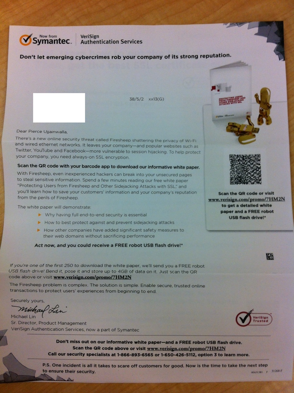
Digital marketing channels like email and social media are a huge part of the modern day marketing mix. However, this is making some of the 'old school' methods like direct mail more effective. For this reason, I was excited to get this direct mail piece from Symantec. It was all really well done, except the most important piece... the landing page.

THE EPIC MARKETING FAIL


So far so good, very creative/compelling direct mail piece

Upon receiving the letter, I was intrigued by the creative image of broken glass over a Facebook page in the large windowed envelope. The tagline, image and message all sparked my curiosity and made me want to open it. Inside the copy was structured around a new white paper. The twist here, is that they want you to access the white paper by scanning the QR code. Cool, I guess. Even better, the marketers introduced a time constraint: the first 250 people who scan it, win a USB Robot! Awesome.

Clever use of QR code and clear call-to-action with time constraint.
Up to this point I was actually thinking I might have to write a blog on Epic Marketing Wins! And then I saw the landing page...

Enormously long and unecessary form landing page.
Why? Why are you asking me for all of my information when you already have it?! You mailed me a letter, the only possible way I could have got to this landing page is by receiving the letter and scanning the code with my QR reader.

This one is really unfortunate. They almost had a home-run, but instead they struck out by sending a bunch of people to their landing page who will likely abandon it due to an enormous & unnecessary form. Who wants to fill out a huge form on their smartphone? Do they have any idea how hard it is to even click inside those tiny boxes?! [sidenote: it took me almost 4 minutes to fill out all the details. That is a lifetime on a smart phone].

THE UN-FAILURE

I need to give some kudos to Symantec for this campaign. They avoided the clutter of the email inbox and leveraged an under-utilized channel. The creative was compelling and actually creative (unlike a lot of campaigns you see these days), the content was good, and they had a compelling call-to-action.

This campaign demonstrates why marketing is only as strong as its weakest link. You could have the best creative, or the best content, or the best call to action, but if one piece is missing the entire campaign will suffer. In this case it's the landing page. A recent study by Marketo showed that for every field you introduce on your landing pages, your conversion rates decrease by 2%. I would imagine this is multiplied to be even higher on a mobile device.

The thing with this campaign is that it is not even necessary to have a form at all. If the campaign was optimized with a tool like QReate & Track they could have personalized the QR codes for each visitor and therefore automatically have known when each prospect scanned the QR code. Conversion rates would have been much higher, and the experience for the prospects would have been better too.

Ah well, here's to hoping I get my free USB robot in the mail...