Monday, May 21, 2012

Why does RIM already hate the Blackberry 10?

[DISCLAIMER]
Hello, my name is Pierce Ujjainwalla, and I am an iPhone user. So despite my bias in phones, let me reassure everyone that my phone preference has nothing to do with the following post. 

THE EPIC MARKETING FAIL
RIM seems to be trying to get in touch with their hipster side with their recent commercials featuring [well known?] artists like Diplo, the Martinez Brothers and most recently Meridith Valiando.

The most recent instalment features the founder of the DigiTour, a company that creates music tours featuring self-made YouTube sensations. The founder, Meridith, says 'I get somewhere around a thousand emails a day... try writing a thousand emails on a touch screen!'


"Try writing a thousand emails on a touch screen!"

Although I don't find it hard to write emails on a touch screen, maybe some people do. Fair enough. Blackberry has the keyboard, a main product differentiator. Good - they are positioning themselves in the market for people who write lots of emails, and offer keyboards on the phones to do it. Great strategy... annnnnd let me now present to you RIM's newest phone, coming out later this year... The Blackberry 10:

Where is the keyboard?
Timing is everything.
The commercial taking a shot at touch screens was aired right around the same time as the world was getting the first sneak peaks at the Blackberry 10. And let me just say, the Blackberry 10 has some pretty awesome features like predictive words and a really cool camera feature that allows you to dynamically change elements of the photo on the fly. In any case, their marketing was not supporting the new phone.

I'm sure there is a perfectly good reason for why this happened, however it's unfortunate that they were not airing commercials that generated buzz for their new phone as opposed to bashing the very features it will have.

The good news about all of this is that the phone looks like it can sell itself and hopefully when the phone is released later this year people will have forgotten all about Meridith and how hard it is to type emails on a touch screen.

Saturday, April 28, 2012

Epic Website Fail

For this post, let's look at an epic website marketing fail:

Flash website fail.


THE EPIC MARKETING FAIL

Open this website, and then come back and read the rest of this blog post. The website took a 63 seconds to load on my machine and my internet is usually pretty fast. On the web, where even patient people have A.D.D., that is about 60 seconds too long. The bounce rates on this website must be really high (close to 100%). In that minute, most people are probably thinking 'I haven't waited this long for a website to load since the days of dial-up internet. This site must be really good'. But, if its on this blog...


It could use some work. The load time is the first issue. Here are some others:

  • After the load screen, you are presented with a bunch of numbers and its difficult to know what to do
  • Then the music starts...
  • The homepage contains a lengthy history lesson
  • About us is a picture of a tradeshow booth with a bunch of servers/technology
  • There is a section about horses and Equestrian (it's an IT security company)
  • Products page is a very difficult to read networking diagram
  • On the contact us section you cannot click on or copy the email address
  • There is a timestamp to show when they updated the site. Some pages date back to 2009

THE UN-FAILURE


Here are the top 5 tips to ensure your website does not end up on Epic Marketing Fails:

1. Don't make a flash website
Flash sites can look great. I've seen some beautifully designed flash websites. The problem with them is usability. If your site doesn't load in under 5 seconds, you are losing visitors. If you are losing visitors, you are losing customers and money. Not to mention all of the iPhone and iPad visitors that are now gone.

2. Design your site for your visitors, not you
There is a fantastic story behind every business, but people are not coming to your website for that - they could care less. They are coming to your website to figure out how they can solve their problems, and are trying to decide if you are the right person to help them do that. Your homepage should clearly tell them what problems you solve, and point them to other pages that help them make their decision.

3. Keep it updated
People want to know that they are looking at recent information. Having at least one section of your website (a Twitter feed is a good one) that is constantly updated at least gives the sense that you care about your website and the people coming to it. If you are not updating your site on a daily/weekly/monthly basis, remove any timestamps that show when it was last updated.

4. Make it easy for people to get in contact with you
Your website should make it easy for people to engage with you. Don't make them search your contact information that is buried on one page. If possible, have chat functionality where people can reach a live person at any time. If you have a CRM system, use a form so you can track exactly where your leads are coming from. If you can't support chat or a form, at the very least make your email address hyperlinked so it automatically opens someone's email application.
5. Create a lead generation engine
Websites are no longer one way vehicles to get your information across. With CRM systems like Salesforce and marketing automation like Marketo, you can transform your site to start generating leads for your business. Offer your prospects something interesting of value, and in turn get their contact information to start a relationship with them. Giving people information is great, but getting theirs in return is even better. That way you can help them along their buying cycle and accelerate their purchase. Not to mention making your business look good and establishing your company as a thought leader in your field.

Tuesday, April 24, 2012

Facebook Marketing Fail

Facebook advertising is a great way to build your company's following. It's a cost effective way to get people engaged with your brand and eventually turn them into customers. The other day I saw how not to do this:

Ottawa Senators or Villanova Dental Studio?
This one is a little misleading. I actually thought to myself, I already 'Like' the Senators on Facebook, why am I seeing this again. Upon closer inspection, it is actually for a dentist's office here in Ottawa.

The only way Villenova Dental Studio is related to the Ottawa Senators would be if you got hit in the mouth with a puck at one of their games and needed some new teeth.

This company is trying to build their following, I get it. However the way this ad is structured, people are not liking Villanova Dental, they are liking a completely seperate brand. I understand all of marketing has a certain element of bait and switch, however like everything, there are certain boundaries that need to be observed.

Why not offer up some great dental hygiene tips or offer a deal on a common service that you provide (whitening anyone?). Although dentistry might not be as exciting as the Senators, there are other options to build your following while still attracting the RIGHT people who might actually turn into customers.

Tuesday, April 10, 2012

Social Media Marketing Fail?

Canada's largest communication provider, Rogers, experience some social media backlash a few weeks ago when they promoted the hashtag #rogers1number to highlight their new service. This lead to a boatload of tweets complaining about Rogers. This was undoubtedly not what they originally signed up for. Lots of people are calling this a marketing fail, but here's my take on it:

Was Rogers promoted tweet a marketing fail or a marketing win?
The great thing about social media is that it is a place to get unfiltered and unbiased information from real people. Companies cannot hide behind traditional one-way communication methods, instead anyone with a Twitter or Facebook account can weigh in and provide their two cents.

Twitter is an invaluable tool as companies can listen to their customers, and receive both positive (and sometimes negative) feedback. The reality is whether its posted on Twitter or not, the feedback still exists... it just may not be exposed for the companies and the world to see/hear.

In the case of Rogers, I'm sure they would have rather people praised their new service and talked about all the great new features like how great it would be for them to call other people for free (not that Skype doesn't do that already - but that's besides the point).

Instead, people publicly bashed the company and #rogers1number was the last thing present in the tweets.

BUT does this make the marketing campaign a fail? Depends how you define success.

If you just wanted people to talk about the new service, then I guess you could say it's a marketing fail, but let's look at the bigger picture.

Rogers clearly has a problem with customer service. That is what everyone is complaining about. That is something the company needs to address. Most Rogers customers (myself included) are not happy with their billing methods. If they weren't sure about this before last Thursday, they have no excuse not to be now.

Although most of the talk was NOT about the new service, they gained a tonne of intelligence (that if used properly) can really improve their business and relationship with their customers. If they are serious about developing and maintaining a positive brand, then this was an essential first step of getting there. 

So in conclusion this is what I call a FAIL/WIN. At first it could look negative, and it did not achieve what they originally set out to do, but in the end they have been given amazing customer feedback that has the potential to really help them down the road.

Monday, March 12, 2012

Tradeshow Fails!

I recently attended the RSA conference in San Francisco and although I spent most of my time at my company's booth, I managed to walk around and take in the rest of the exhibit hall. It never ceases to amaze me the scale of this show and the amount of awesome booths that scatter the floor. As you can imagine, I also managed to capture a couple of fails!

Chowing down on some food... right at the booth!
People have different opinions on tradeshow etiquette, in terms of what is acceptable and what's not, but I couldn't believe this one. Three people from this company sitting around the reception table at their booth eating their lunch (sidenote: the food looked delicious).

Okay, maybe this is a cultural difference, however most attendees at this conference were from North America and would be unlikely to interrupt someone's meal to have a conversation about that company's products and services.

Booth space at this conference is really expensive so every second you can be talking to prospects needs to be used. There are three people at this booth so they could have alternated when they ate and done so away from their booth.

Screen of death.
A couple of booths had these cool & interactive iPad-like screens where you could get information about the company and in some cases send yourself the datasheets and white papers. I think this is a great way to engage people on the tradeshow floor, get new names into your database and it's way better than cutting down a forest for all your brochures.

However, my former employer IBM seemed to be having some issues with theirs, and as I went to discover 'What is Watson' I was presented with a 'Not Responding' screen. Everyone has technology issues now and then, but it was unfortunate that it happened as I actually wanted to see what it would do.

Anyways, I always strive to bring the positive alongside the fails, so here are 3 tips that are guaranteed to make your next tradeshow more effective: 

1. Give attendees a reason to stop in and check out your booth
Give away a small/inexpensive prize on a regular and consistent basis. In order to win the prize, people need to stick around and listen to a quick overview about your company. This is your opportunity to educate attendees, make them familiar with your company, attract a big crowd and build your brand. You are already paying a lot to get the booth space, so put aside a little money for prizes and it will be well worth your while.

2. Follow-up with your attendees in a timely manner & make it engaging
Scott Stratten wrote a great marketing book called Unmarketing, where the focus is on engaging with your prospects. Tradeshows offer a great opportunity to do this, and you should use it to start a conversation with the people who stop by your booth as opposed to just blasting them with your brochure. Do it as soon as you can, on the same day they stopped by if possible, and you will be amazed with the results.

3. Speak at the conference
Although speak ops are usually expensive, there is a reason for that. It positions your company as a thought leader, and someone who is trying to solve the problems that attendees of the conference are having. As long as your presentation is not 'salesy' it will shift attendees view of your company from 'trying to sell me stuff' to 'trying to help me with stuff'. And that is a major difference.

Friday, January 20, 2012

Landing Page Fail

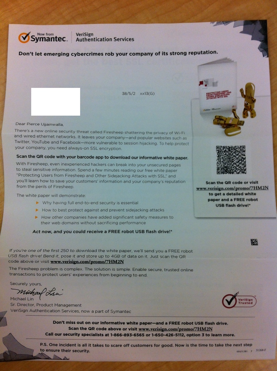
Digital marketing channels like email and social media are a huge part of the modern day marketing mix. However, this is making some of the 'old school' methods like direct mail more effective. For this reason, I was excited to get this direct mail piece from Symantec. It was all really well done, except the most important piece... the landing page.

THE EPIC MARKETING FAIL


So far so good, very creative/compelling direct mail piece

Upon receiving the letter, I was intrigued by the creative image of broken glass over a Facebook page in the large windowed envelope. The tagline, image and message all sparked my curiosity and made me want to open it. Inside the copy was structured around a new white paper. The twist here, is that they want you to access the white paper by scanning the QR code. Cool, I guess. Even better, the marketers introduced a time constraint: the first 250 people who scan it, win a USB Robot! Awesome.

Clever use of QR code and clear call-to-action with time constraint.
Up to this point I was actually thinking I might have to write a blog on Epic Marketing Wins! And then I saw the landing page...

Enormously long and unecessary form landing page.
Why? Why are you asking me for all of my information when you already have it?! You mailed me a letter, the only possible way I could have got to this landing page is by receiving the letter and scanning the code with my QR reader.

This one is really unfortunate. They almost had a home-run, but instead they struck out by sending a bunch of people to their landing page who will likely abandon it due to an enormous & unnecessary form. Who wants to fill out a huge form on their smartphone? Do they have any idea how hard it is to even click inside those tiny boxes?! [sidenote: it took me almost 4 minutes to fill out all the details. That is a lifetime on a smart phone].

THE UN-FAILURE

I need to give some kudos to Symantec for this campaign. They avoided the clutter of the email inbox and leveraged an under-utilized channel. The creative was compelling and actually creative (unlike a lot of campaigns you see these days), the content was good, and they had a compelling call-to-action.

This campaign demonstrates why marketing is only as strong as its weakest link. You could have the best creative, or the best content, or the best call to action, but if one piece is missing the entire campaign will suffer. In this case it's the landing page. A recent study by Marketo showed that for every field you introduce on your landing pages, your conversion rates decrease by 2%. I would imagine this is multiplied to be even higher on a mobile device.

The thing with this campaign is that it is not even necessary to have a form at all. If the campaign was optimized with a tool like QReate & Track they could have personalized the QR codes for each visitor and therefore automatically have known when each prospect scanned the QR code. Conversion rates would have been much higher, and the experience for the prospects would have been better too.

Ah well, here's to hoping I get my free USB robot in the mail...

Tuesday, January 10, 2012

Another QR Code Fail!

My first epic marketing fail blog post featured a QR code on the side of a highway on-ramp. I have found perhaps one that tops that one!


Fast moving QR Code Fail!
If someone can tell me what that ad is for without going to the website I will give you a cookie.